I'm sure this is just another entry in a sea of blogs pondering the inferiority of the lackluster
Prometheus (2012), compared to the masterpiece that is
Alien (1979). I just couldn't help myself. As more and more images from
Prometheus became available I was constantly comparing the designs to the original
Alien, so I figured I might as well make a blog of it.
First of all, it's pointless to discuss whether
Alien and
Prometheus take place in the same universe. They do.
It's equally pointless to compare the technology of a 30 year old film to a new one, even though the new film takes place 33 years before the old one (in 2089). However, we'll do that anyway. And finally there's the question of sheer aesthetics. Elements that can't really be compared on a factual level, can be compared aesthetically and conceptually. We'll do that too. Oh, and of course there'll be
major spoilers.
So, without further ado...
THE SPACESHIP
Nostromo and Prometheus are two different spaceships, with two different purposes. That's not the issue. The issue is the presentation of the two ships. One shrouded in moody darkness, the other unceremoniously revealed in broad daylight.
I'm not too crazy about the design choice on the new ship either, but that's just personal preference.
I'll flat-out admit that both landings are pretty spectacular, but I respect the work done in
Alien far more. No computer assistance back then. Those effect guys had to work for a living.
THE CREW
Then there's the crew. The first images released from
Prometheus already caused some concern. Charlize Theron and Idris Elba looked too pretty.
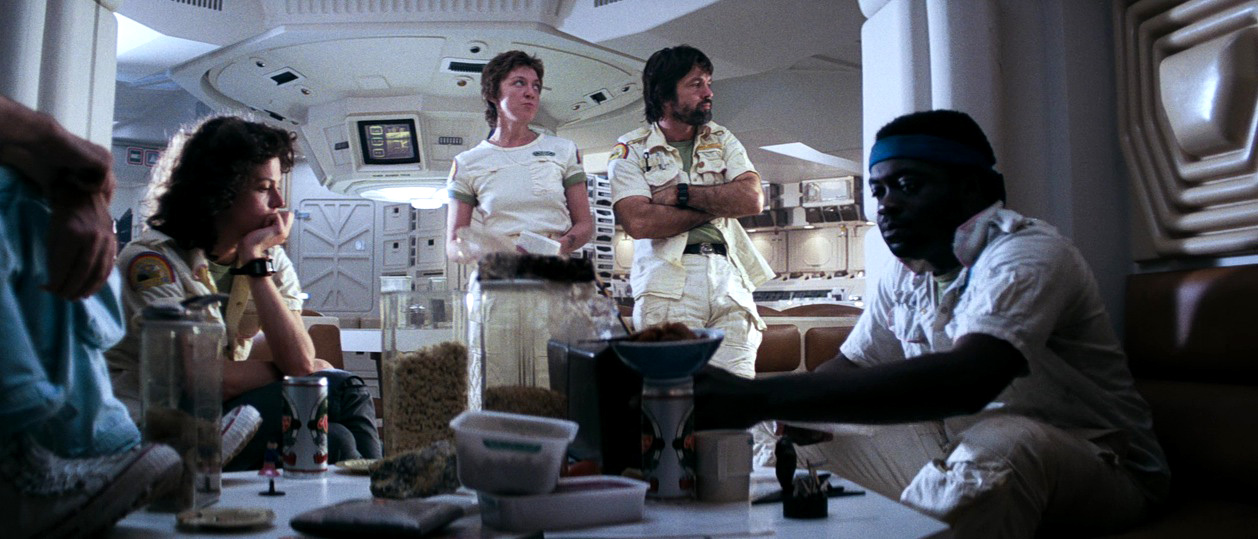
The film confirmed the initial fear. The Prometheus crew looks completely bland and polished next to the rugged and rough Nostromo crew.
I also want to mention the horrible briefing scene in
Prometheus. There's no equivalent in
Alien, but there is in
Alien vs. Predator (2004). Now you know you're in trouble!
An
Alien-film cast looking at ancient crap. Sorry Ridley, Paul Anderson got there first...
The problem with the designs of
Prometheus are perfectly illustrated when we look at the space suits. From rough, efficient work clothes in
Alien:
To silly spandex, with plastic padding. This crew looks like it's ready to play futuristic hockey. And what's with the orange lines on Noomi Rapace's suit? Non-functional crap from a lazy designer.
But wait! What's this? At least one of the other crew members (meaning, not one of the fit, well-groomed stars) actually gets to wear a proper space suit! How about that?!
INTERIOR
The interior of the Prometheus is as badly designed as the rest of the film. First, look at the original
Alien cockpit. How cool is that?
Now compare to the Prometheus design. Dull and uninspired.
The forward cockpit design:
And the controls design:
Is this a good time to remind everyone that
Prometheus takes place 33 years BEFORE
Alien?
TECH
I should shut up about the 33 years, but how can I in the face of the following examples?
The hypersleep chamber certainly got a downgrade.
So did the navigation tools:
...And the medical scanner:
And the medical facilities just looks silly, compared to the low key
Alien design, though it's fair to argue that Nostromo just has a simple lab, whereas Prometheus is a research vessel. Still, what is the function of the light UNDER the table?
THE SPACE JOCKEY
My biggest beef with
Prometheus is how it screws with the concepts
Alien established. I would say it ruins them, but
Prometheus is so inferior that it has no influence on my appreciation for
Alien. In that respect the movies aren't in the same universe. Not even in the same dimension.
The control chair from the derelict spaceship in
Alien was recreated for
Prometheus. It's not the same ship, but the same design. The original film followed the designs of H. R. Giger perfectly.
Look at the details here:
Now let's look at the
Prometheus version. Suddenly the control room (again: different ship SAME design) sports some odd hypersleep pods, which the film will put to (bad) use later. It also features a weird control chair. Why? The big chair in the middle controls the ship! What do you need another control chair for? And notice how the designs and the details on the walls look flat. They're completely missing that organic, boney design of the original.
The pilot aka the Space Jockey has also been altered. Again the original film followed Giger's design to a T. Take note of the size of the arm, relative to mounting bracket (or whatever that is). In the original design the lower arm is twice as big as that bracket is wide.
Now look at
Prometheus. Suddenly the guy's ENTIRE arm is virtually the size of the bracket. Somehow that race grew to twice the size in 33 years, less actually, because the
Alien specimen had been dead for a while.
Even in these other images, it's clear that the Space Jockey grew phenomenally from
Prometheus to
Alien:
As for the Spacey Jockey himself, it's clear that the remains found in
Alien is a fossilized skeleton. It's hard to tell where the Space Jockey ends and where the chair begins, because the two have almost grown together.
But now in
Prometheus. It's just a uniform! Yaaaaay! That's a GREAT idea. I mean, why wouldn't an alien race create a helmet design that looks like a different creature? And the fossilized bones are now just a seat belt.
That's safe and sweet. Ahhhh, now the kids can join in. No more nightmares about those awful creatures with elephant-like trunks, twice the size of humans. Now they're just tall guys with weird helmets, concerned about safety!
Here's a closer look at the helmet, the definition of a missed opportunity.
And if you're still wondering about those nice creatures... How can they be bad, when they wear proper underwear?
AND FINALLY
I'm gonna have to wait for the Bluray to make a proper comparison on some of the other elements in the films, but just in case it wasn't clear,
Prometheus is shite.
Here's what it looks like when the space truckers of
Alien are lured to a weird space ship:
And here's the
Prometheus equivalent. A straight road, and cars:
This is what the original creature looks like:
And here's the one in
prometheus:
One of them will still be talked about in another 30 years. The other will be forgotten next month. And while you ponder that, here is what the
Prometheus filmmakers decided was a scary and interesting conclusion to their story.
A giant squid, eating a tall pale man. Oh joy. What's that old saying about pictures and words?
Prometheus was a massive disappointment, no sane person would claim otherwise. Even those who hate it, often say, "Well, at least it looked good".
I beg to differ. I think it looked stupid, and after these examples, are you really going to disagree?
All images copyright © 20th Century Fox












 Posts
Posts


